
Please visit on a desktop for the best experience!
Overview
In an era where connectivity shapes our daily lives, creating community and enhancing communication within senior living environments is paramount. As our population ages, the need for intuitive and inclusive digital solutions becomes increasingly evident. I aimed to create platform designed to be a communication tool between staff members and residents, focusing on the app side for residents.
My Role
User Research
UX/UI Design
Animations
Prototyping
Tools
Figma
Photoshop
Google Forms
Problem
Communities struggle to bridge the gap between tech-savvy younger residents and technology-resistant older generations, especially with the influx of baby boomers.
Communities are at a crucial juncture as they navigate through a significant transition in technology usage. On one hand, there are older residents who adamantly resist technology, favoring traditional modes of communication. On the other hand, younger residents who are comfortable with using cell phones, embrace technological advancements. With the influx of newer generations (baby boomers) into communities, reliance on technology is set to increase. Communities must market to these future residents and offer technological services while ensuring they continue to cater to the needs of older residents who may not be as tech-savvy.
Outcome
The strategy focused on bridging the technology divide among residents of varying ages, ensuring inclusivity and accessibility in the app. It holds potential for expansion across multiple platforms, offering opportunities for continued research and development to enhance user experience.
Goals
Engage
How can we increase engagement among older residents who are hesitant to adopt new technology?
User-Centric
In what ways can we design intuitive interfaces that cater to varying levels of tech-savviness among residents?
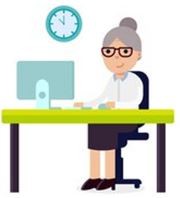
Connect
How might might we facilitate seamless communication between residents and staff members through the app?
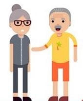
Involve
How can we inspire residents to join community activities and events through the app?
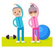
Research
Method #1
Competative Analysis & App Reviews
Currently, there's a scarcity of apps facilitating direct resident-to-resident communication in senior living communities. Most apps emphasize staff, resident, and family communication, primarily focusing on health-related aspects. One obstacle I faced was the necessity for accounts to access many internal communication apps in these communities. This led me to depend on screenshots, reviews, and website information for insights.
To view the competative analysis, please click
Method #2
Qualitative and Quantitative Data
Collaborating with a nearby senior living community, I conducted a user surveys and interviews to understand the residents' relationship with technology. The survey aimed to gauge their comfort levels with technology, their usage of apps and devices, if any, pinpoint their technology-related challenges, and identify features that would be valuable for their age group.
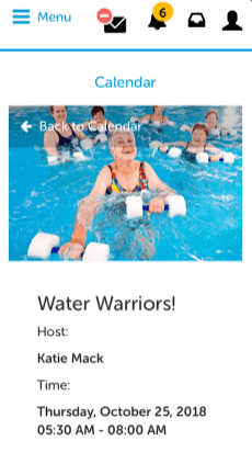
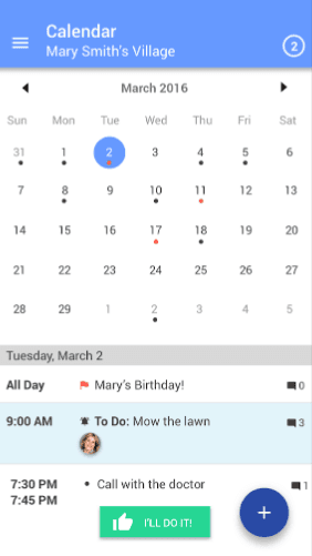
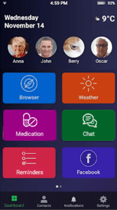
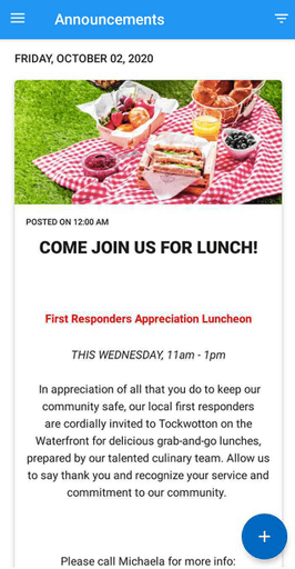

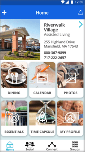
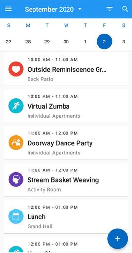

"A comprehensive onboarding process is essential for residents using the Community Connect app, offering a guided introduction that familiarizes users with key features and functionalities."
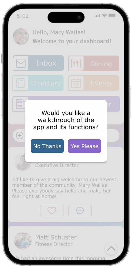
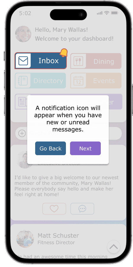
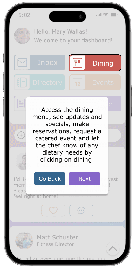
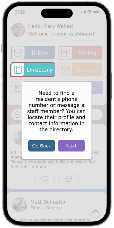
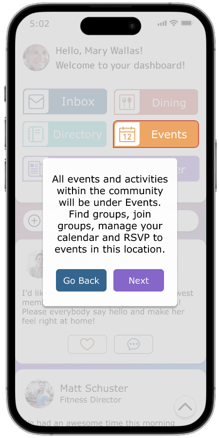
The elderly often resist technology due to unfamiliarity and potential frustration with its use, alongside a reluctance to change their habits. Therefore, implementing an effective onboarding process is vital for residents to help them feel at ease and adept with its features. The app can begin with a guided introduction, offering a tour or walkthrough during the initial login, highlighting essential features, explaining navigation, and demonstrating common actions like messaging, group joining, and event RSVPs.
Survery Findings
"Appointment, activity, and event reminders for user convenience, ensuring straightforward navigation with accessible options like larger fonts and easy-to-use buttons, is paramount."
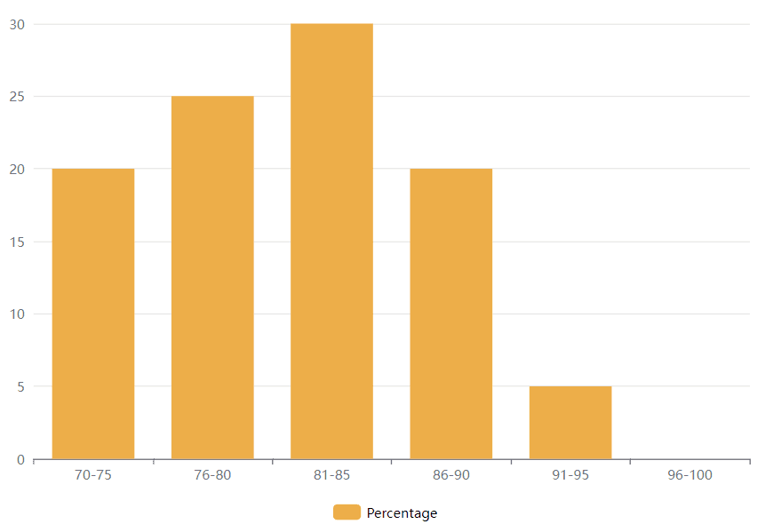
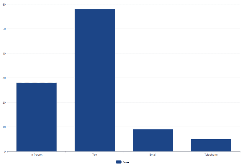
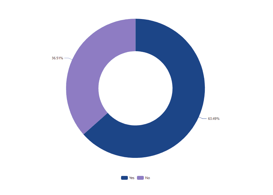
To the right are a selection of questions asked during the survey. I was slightly surprised by the data. I anticipated a less tech-savvy population based on the age ranges and assumptions of older people. These insightful responses will guide me in identifying opportunities to integrate into the app.
What is your age range?
What is your preffered mode of communication with your fellow residents?
Do you currently use social media platforms, such as Facebook?
Do you often participate in community events or activities?
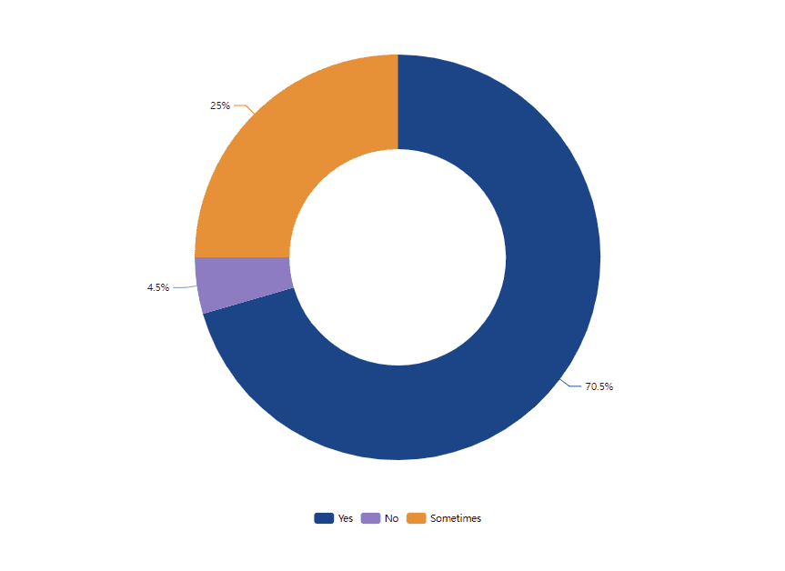
How do you typically stay informed about upcoming activities?
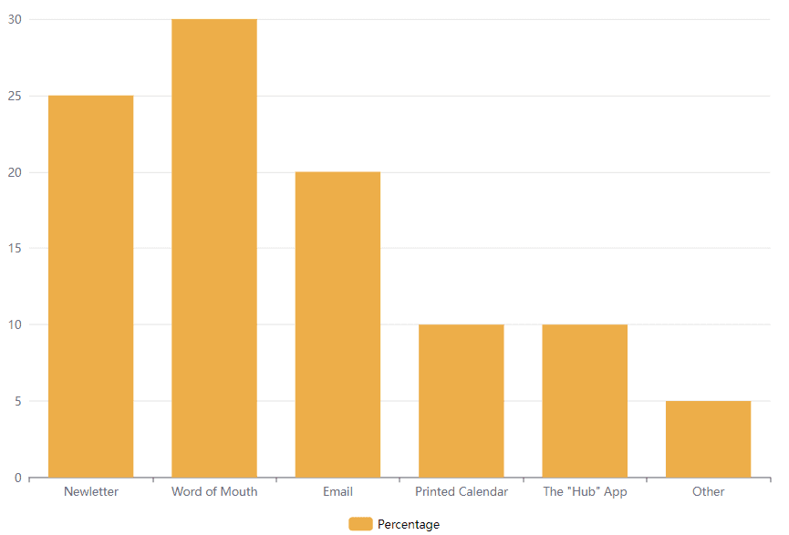
How comfortable are you with using mobile apps?
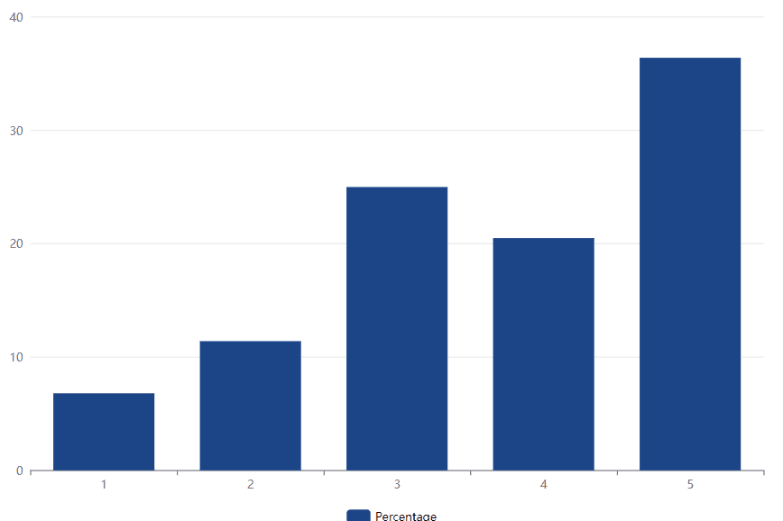
Do you encounter challenges in terms of screen readability while using apps?
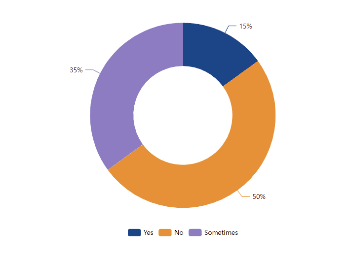
Do you use a calendar to organize your daily activities?
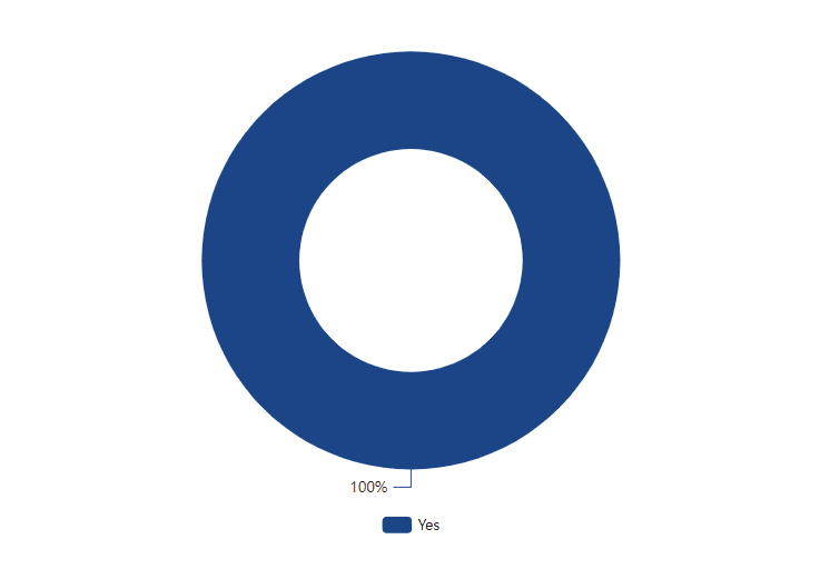
What is your age range?

What is your preffered mode of communication with your fellow residents?

Do you currently use social media platforms, such as Facebook?

Do you often participate in community events or activities?

How do you typically stay informed about upcoming activities?

How comfortable are you with using mobile apps?

Do you encounter challenges in terms of screen readability while using apps?

Do you use a calendar to organize your daily activities?

Synthesizing
The detailed user data, MVP focus, and identification of personas guided the app's development to address key user needs and motivations effectively.
The data from user surveys and interviews emerged as a complex and diverse set of responses. By prioritizing the MVP and aligning with business goals, I was able to pinpoint the most critical aspects for the user group. This approach led to the identification of three distinct personas, allowing me to grasp their motivations, goals, and pain points effectively. This understanding was instrumental in creating an impactful and tailored experience within the app.
To view the user personas, please click
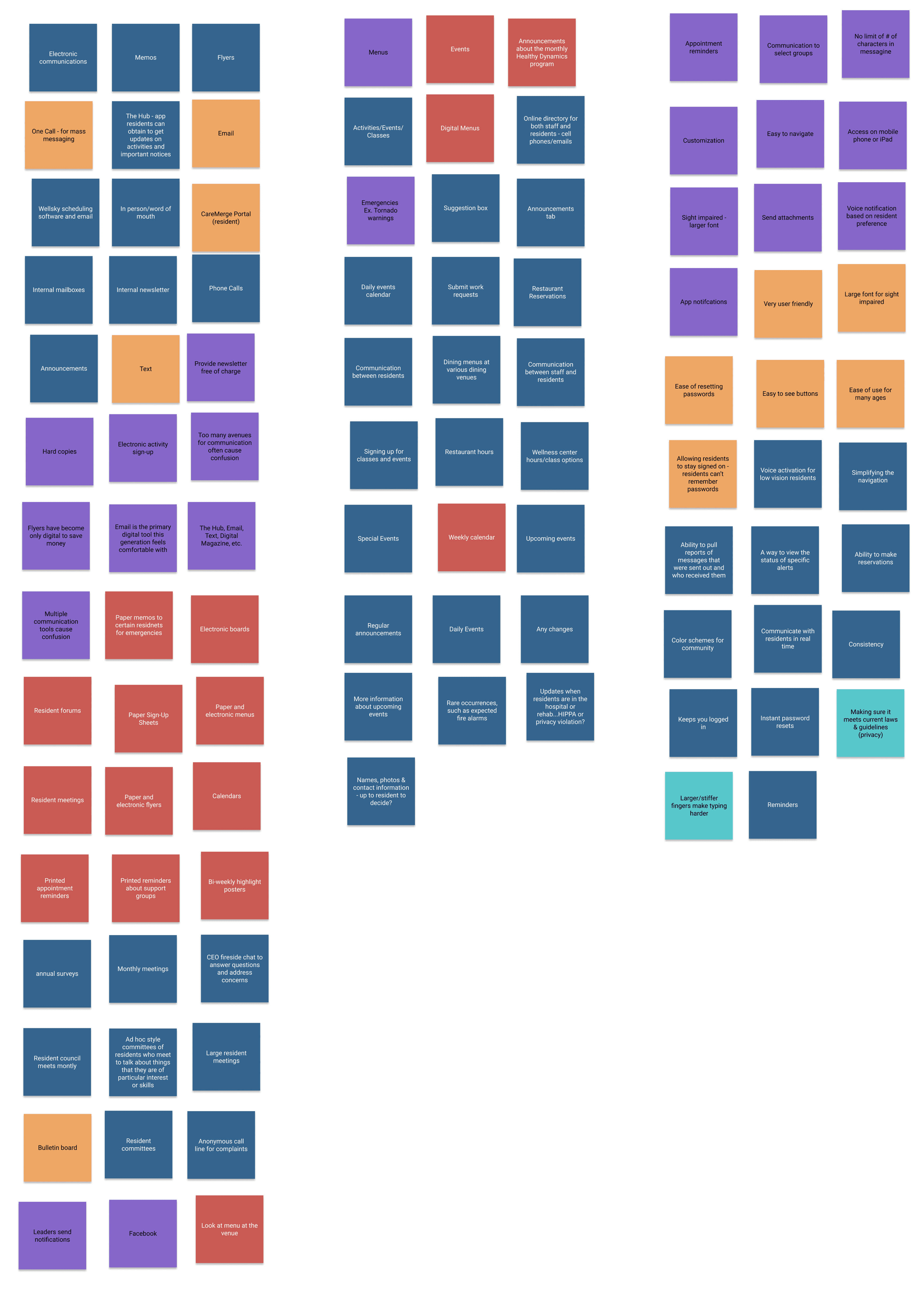
The research gathered was organized in an affinity map and grouped into 3 main categories in order to draw insights.
Ways of communication
Types of information that is shared
Possible features
Needs
To be reminded of appointments, activities & events
Ease of navigation so even non tech-savvy people can use the app
Larger font for sight impaired as well as easy to see/press buttons
Dining information, activities/events, directories, community news, messaging
Wants
No limit on number of characters in messaging or posts
Access on phones, tablets and desktops
A way for the app to keep residents logged-in
Instant password resets
Desires (not aligned with MVP)
Customization to specific communities, ie. colors
A way for staff to view the status of specific alerts sent out to residents.

Building the Structure
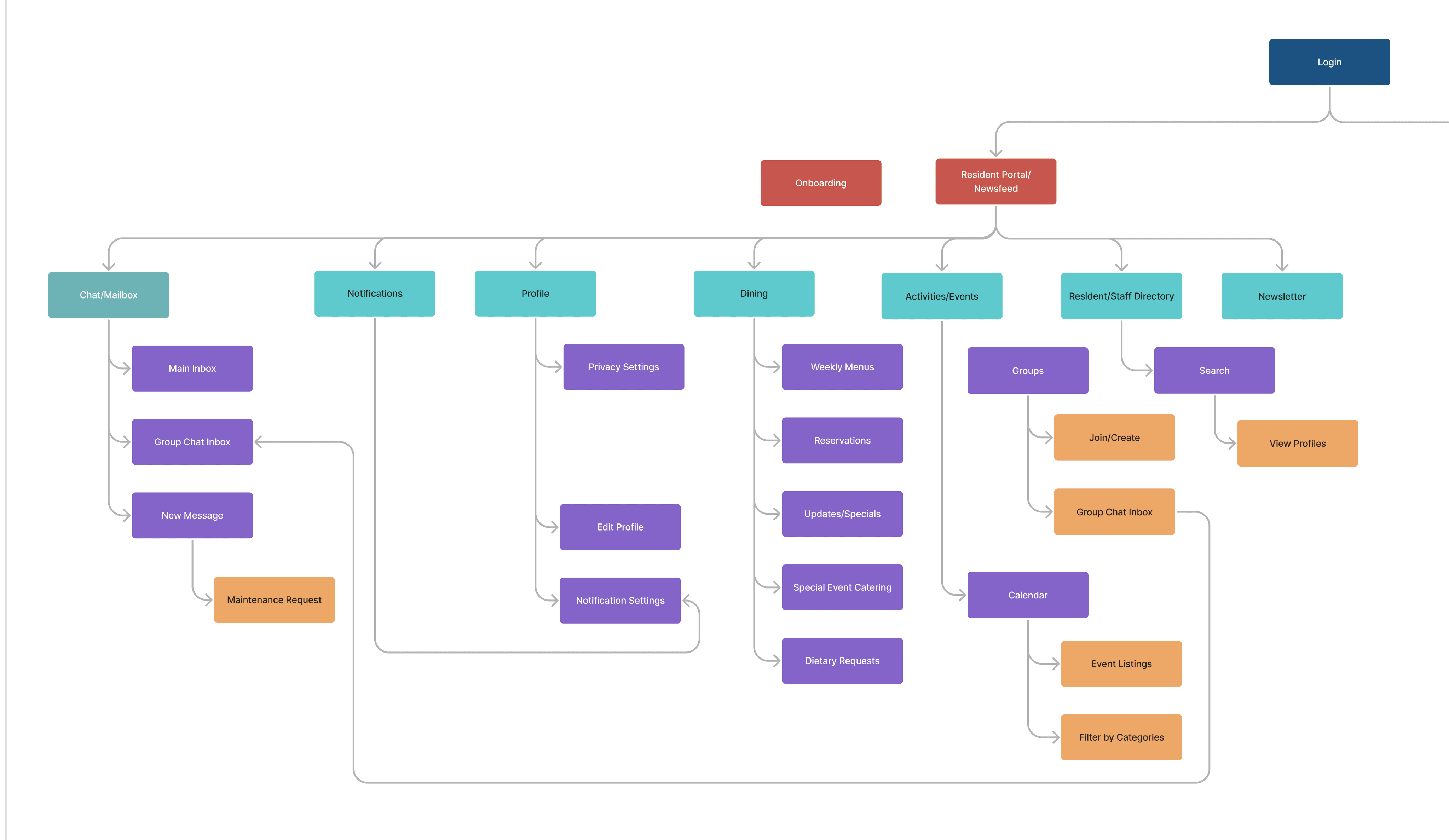
During this phase of the project, I dove into the creation of the site map in order to outline the hierarchy of pages, content, and navigation paths, which helped in planning and organizing content for a user-friendly experience. As mentioned, the business goals were currently focused on the resdient side of the app. Ideally, the other portion of this app would introduce another user group: staff members.
Sketches
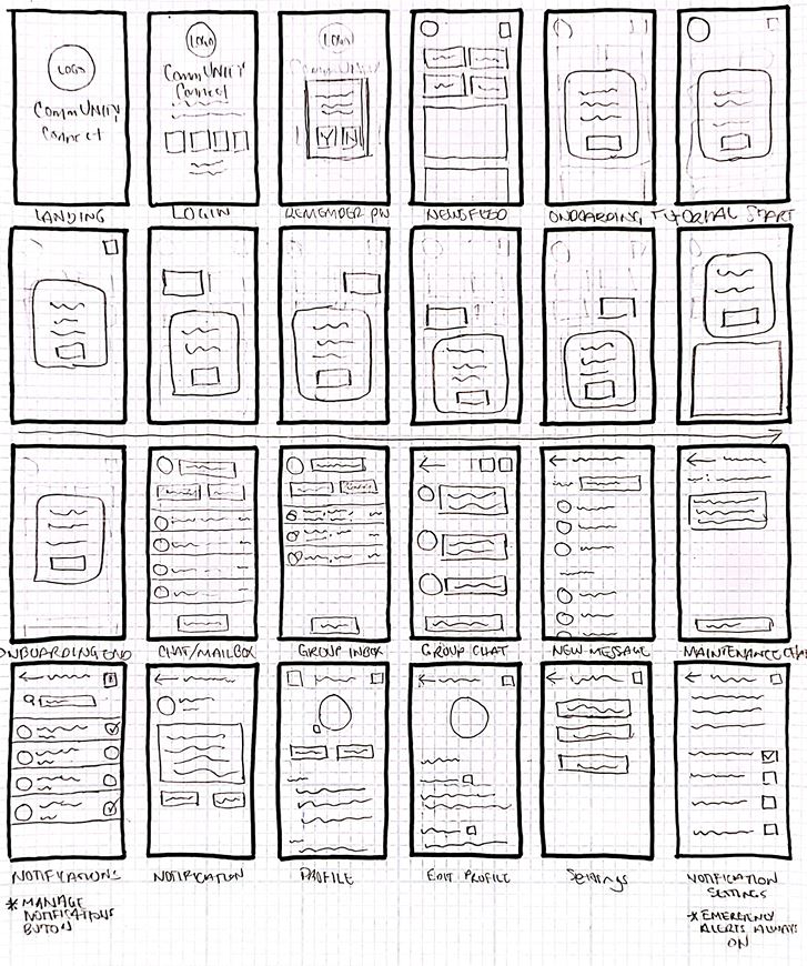
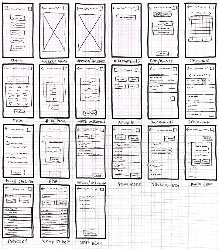
Pen-and-paper sketches for planning app features like the onboarding walkthrough and messaging, ensuring clarity for all users.
I find that I think most quickly when I use pen and paper. I sketched out my ideas for each main feature of the app: the onboarding walkthrough, messaging, dining information, directory, events, and community news.
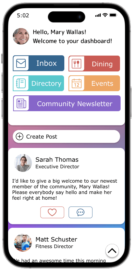
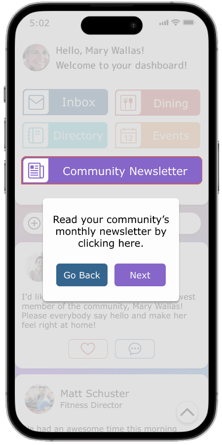
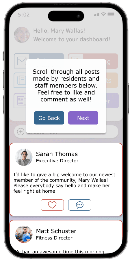
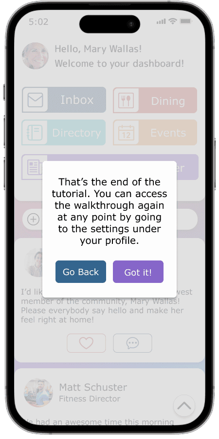
The walkthrough holds significant importance in the design process. Not all users may be familiar with platforms like Facebook, so it's essential to explain the functionality of each button and what users can find in each section. Furthermore, users can watch the walkthrough as many times as necessary, as explained at its conclusion.


Usability Testing
Valuable insights were gained for enhancing mid-fidelity wireframes, including seniors' color preferences, button sizes, and font legibility.
After sketching my design, I transferred it to Figma for usability testing. I skipped low-fidelity testing due to concerns about the older age group's navigation difficulties. However, mid-fidelity testing yielded valuable feedback, guiding significant improvements in my high-fidelity wireframes. Through this process, not only did I gain insights into the tasks at hand, but I learned more about seniors' needs regarding colors, button sizes, font legibility, and font types suitable for their eyesight.
To see some of the changes made from low-fidelity to mid-fidelity, please click
Task Completion Metrics
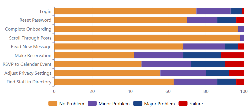
"Completing the onboarding was a breeze, but I got stuck on the privacy settings afterward."
"Scrolling through posts was easy, but I struggled with finding the RSVP button."
"My fingers don't work as good as they used to. There were too many buttons to push when making a reservation."
"I felt like I was getting lost in the app sometimes with how many new pages there were."
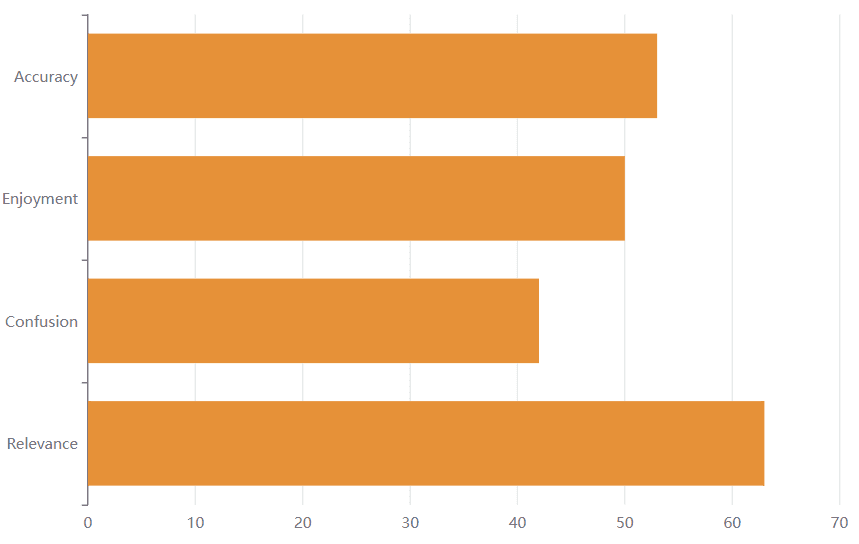
53%
of the participants that successfully completed all tasks
50%
of the participants that enjoyed the tasks
36%
of the participants that complained about the app complexity
47%
of the participants who were unable to complete all tasks
41%
of participants that struggled with completing a dinner reservation
64%
of participants that believe the app has potential to function better than their current community app
Testing challenge stemmed from seniors' tech reluctance, demanding a careful distinction between fixable issues and resistance to change.
The challenges during usability testing stemmed largely from seniors' reluctance to adopt new technology. I had to carefully assess whether issues were app-related or due to residents' resistance to change. Staff noted concerns about feeling excluded if the community transitioned fully to technology. Distinguishing between fixable problems and resistance to technology was key in addressing feedback.
Recommended Improvements:
Simplify Navigation: Streamline the app's navigation by reducing the number of menu options and organizing content in a clear and intuitive manner. Use familiar icons and labels for easier recognition.
Enhance Text Legibility: Increase font size and choose legible font styles to improve readability, especially for users with vision impairments. Consider offering options for font customization based on user preferences.
Optimize Button Accessibility: Ensure buttons are sufficiently large, well-spaced, and responsive to touch, catering to users with limited dexterity. Implement visual feedback (e.g., color changes) when buttons are tapped.
Simplify Complex Features: Simplify complex features or functionalities by breaking them down into manageable steps or offering advanced options as optional settings for users who are more tech-savvy.
Provide Help and Support: Incorporate easily accessible help resources, such as FAQs, tutorials, or a help center within the app. Offer in-app support chat or a helpline for immediate assistance.
Improve Engagement: Add features that enhance user engagement, such as social forums, discussion boards, or virtual events tailored to seniors' interests. Encourage social interaction and community building within the app.
UI Decisions
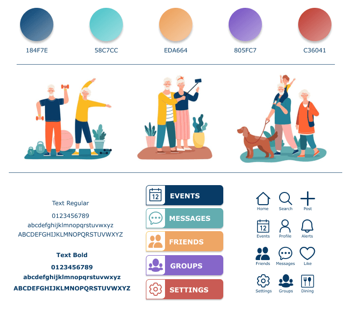
Sans-serif fonts are generally the easiest to read due to their clean lines and lack of decorative flourishes. I chose to use Verdana.
The majority of the font size is 18.
Main buttons use 24 font. This is due to the button size itself. As we age, it becomes more difficult for us to use our fingers. If the buttons are larger, they will be easier to press.
The easiest colors for older people to see are blue, green, purple, red and orange. These colors should be the dominant colors in the design.
Preferred Colors
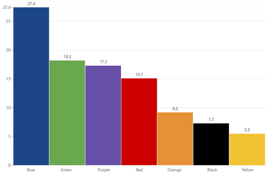
I created a mood board using the gathered insights. I adjusted the colors slightly, opting for teal instead of green, considering it's cohesiveness with the other colors. The app aims for simplicity yet emits a youthful and playful vibe. While vibrant colors contribute to this feel, maintaining appropriate contrast ensures readability.
Iteration
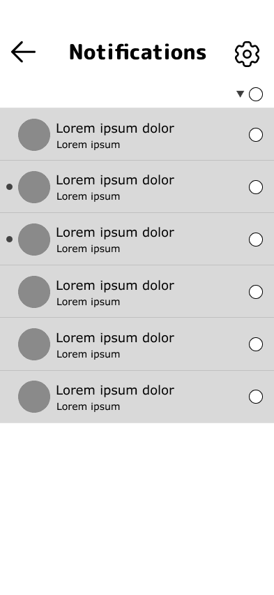
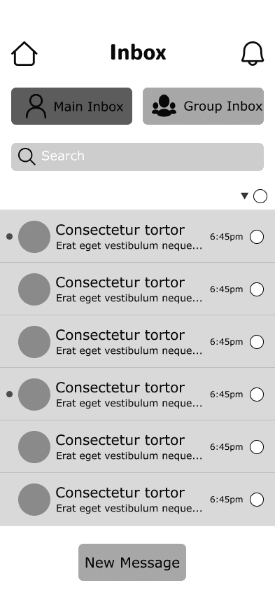
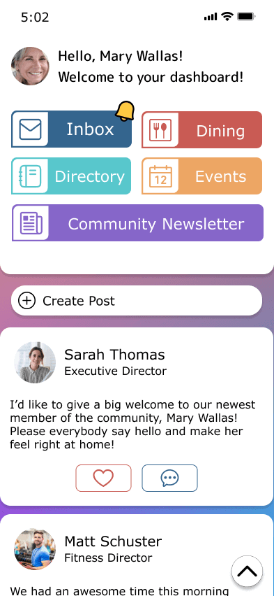
When considering ease of use and streamlining the app's interface, a significant change during mid-fi wireframing involved the notifications page. The notifications page served a similar function to the inbox, essentially adding an unnecessary step for users. By relocating the notification icon next to the inbox button and eliminating the notifiations page altogeher, this extra step was eliminated for users. New messages would be similarly indicated as before, with a dot next to unread messages.

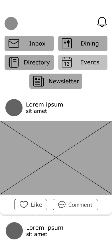

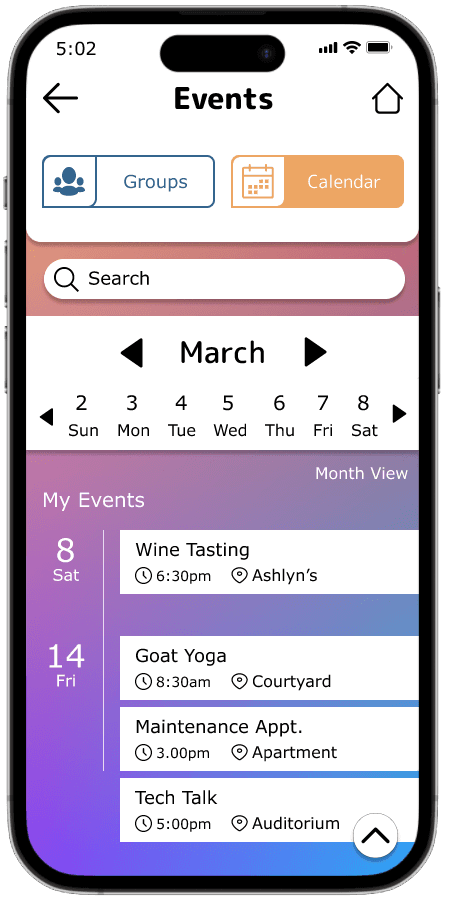
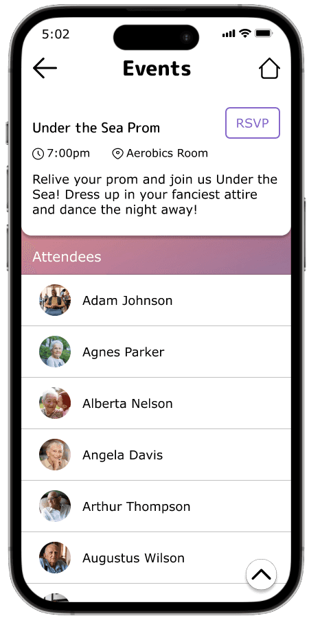
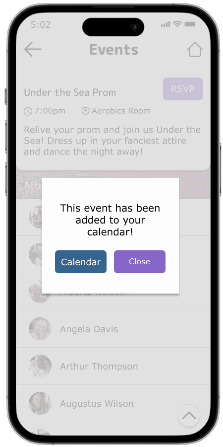
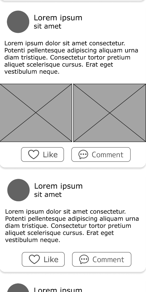
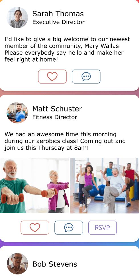
Text was removed from the like and comment buttons to allow for space of an RSVP button on event posts. Similar to the above, this eliminates an extra step for the user to attend an event. It also allows staff members to see which residents are attending that specific event.

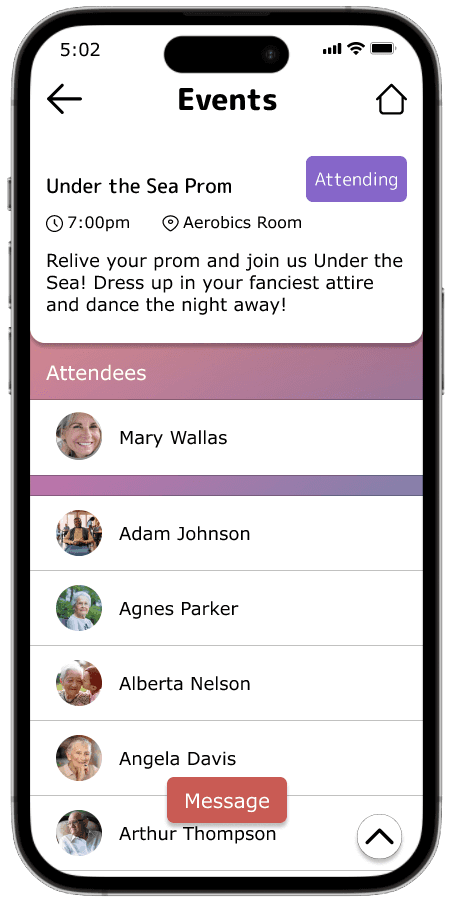
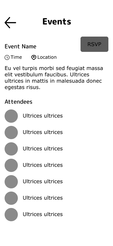
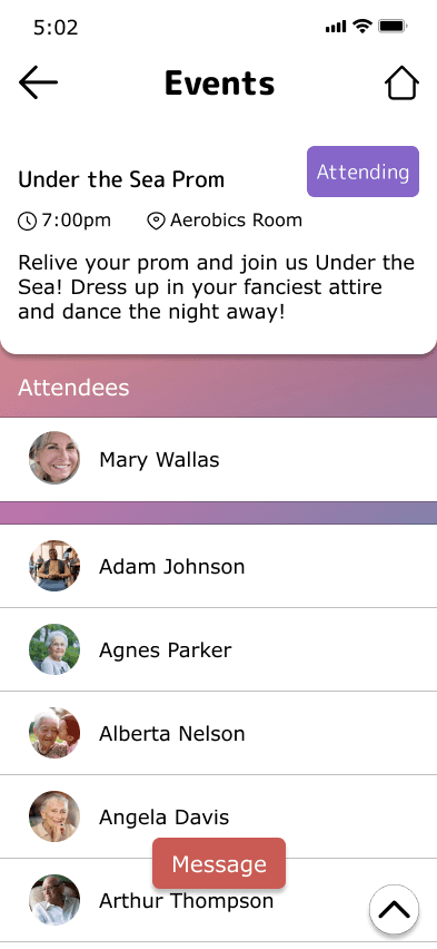
A message button was added to the button of the events page after tapping RSVP. There are residents who are married and requested for the opportunity to RSVP for others. This allows the user to message the creator of the event and add a "plus 1."

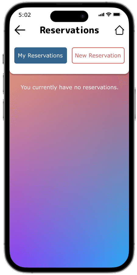
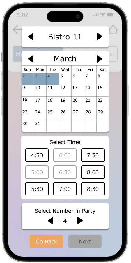
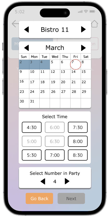
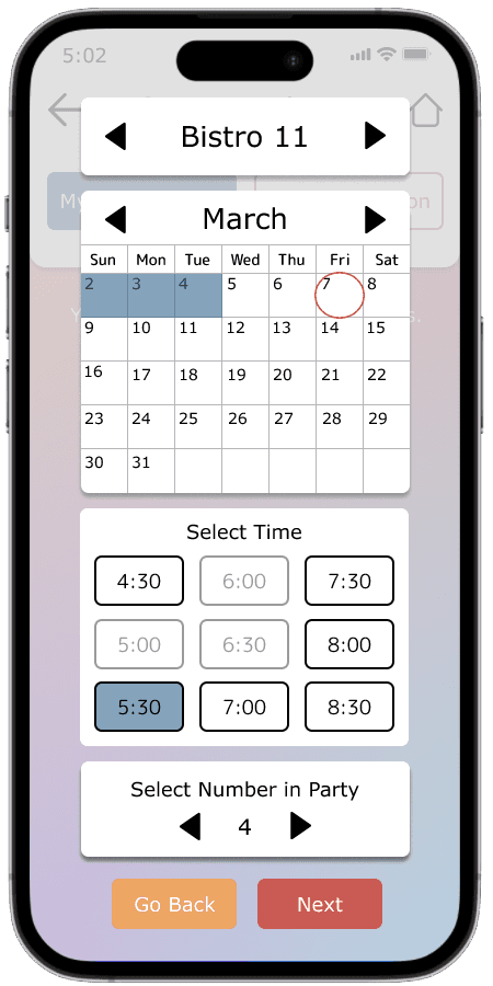
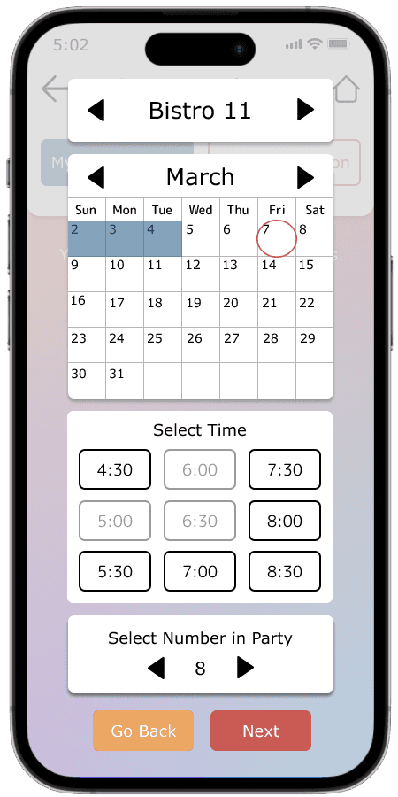
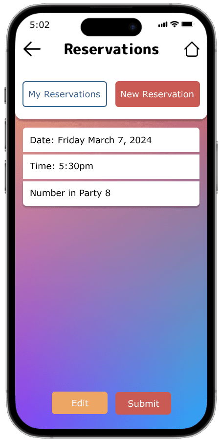
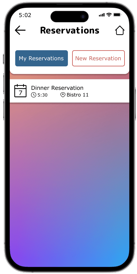
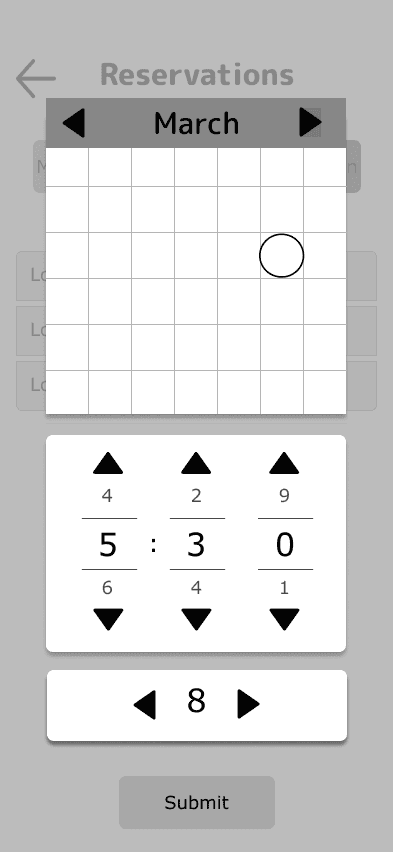
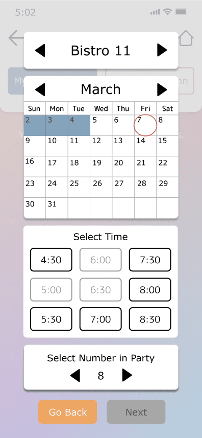
Additional clarification was required when making reservations. Communities often times have multiple dining venues, leading to the need for a way to select specific restaurants. It was also requested to add text to communicate what was needed when choosing a time and number of people in the party. Lastly, requiring the user to pick the time - 1. resulted in too many "taps". Seniors have a hard time using their fingers so it's best to have the least amount of taps as possible, and 2. made it more complicated for staff members to have to confirm or deny the reservation time. This way, residents can see what it available or what is not.


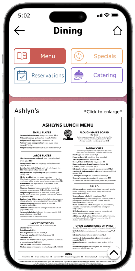
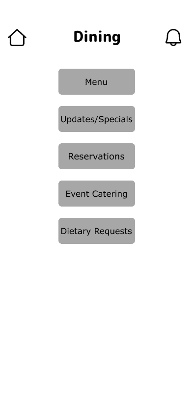
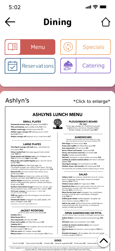
When selecting "Dining" from the main dashboard, the first screen that is shown became the Menu. There was no need for a user to have to click again, especially since viewing the menu is the most common action.
Buttons were also condensed to reduce the wasted space. And as requested from staff, the "Dietary Restrictions" button was eliminated due to it becoming too personalized and causing complications for the dining staff.

Prototype
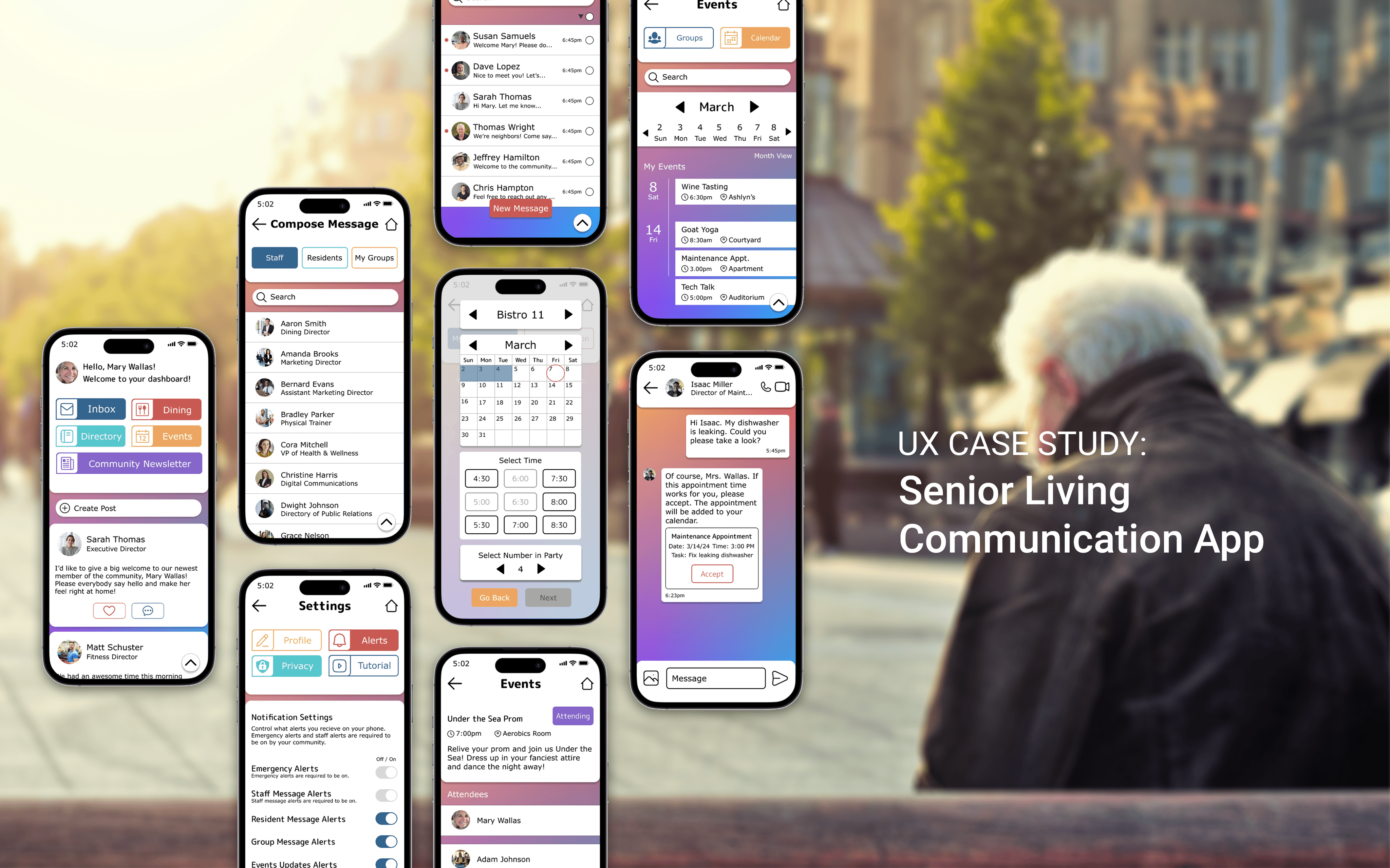
Dashboard & Tutorial
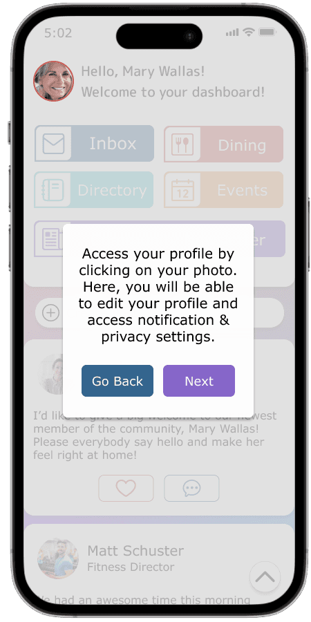
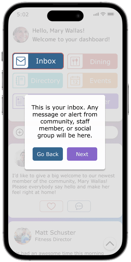
Due to a significant amount of residents that aren't the most tech-savvy, it was important for there to be a feature that walks them through the app and teaches them how to use it. This would only occur the first time logging into the app, however, residents can always go back through it by navigating into the settings, as explained on the last screen.
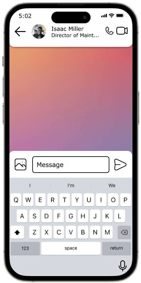
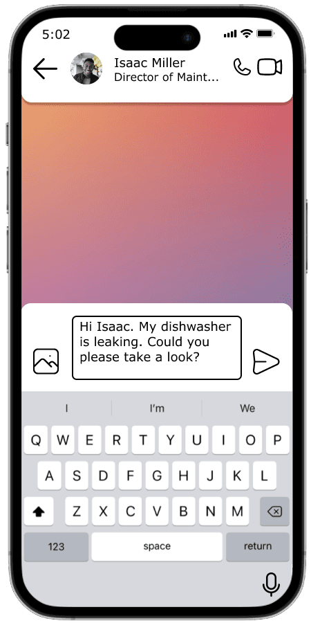
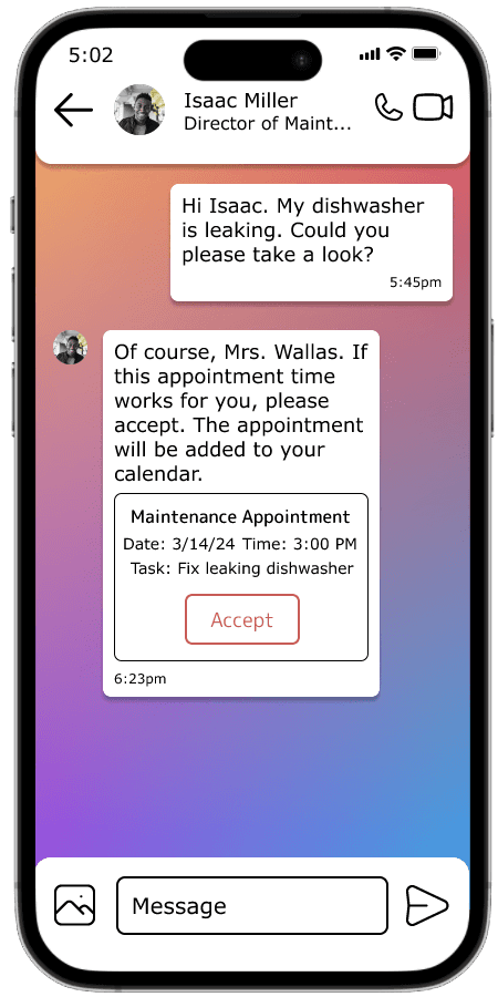
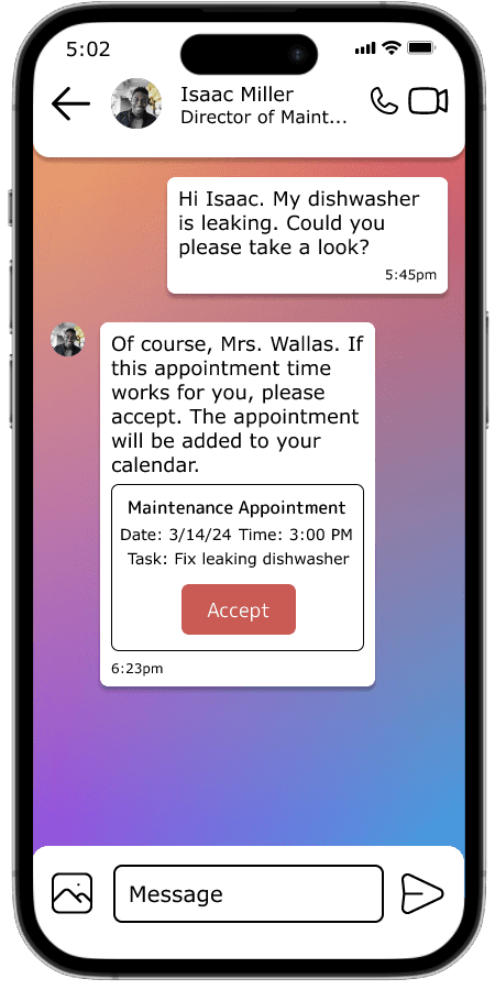
Inbox & Chat
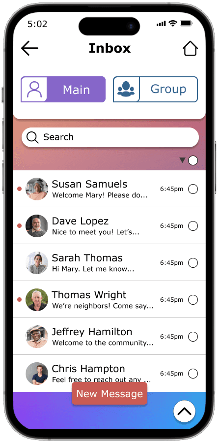
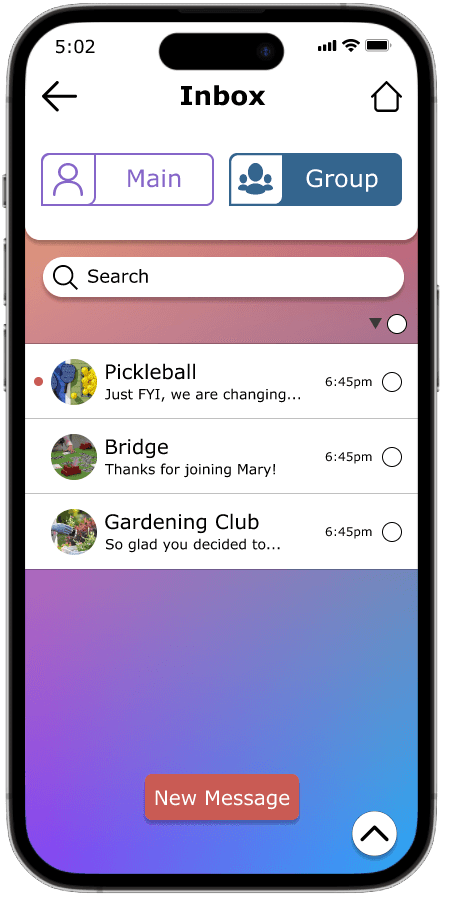
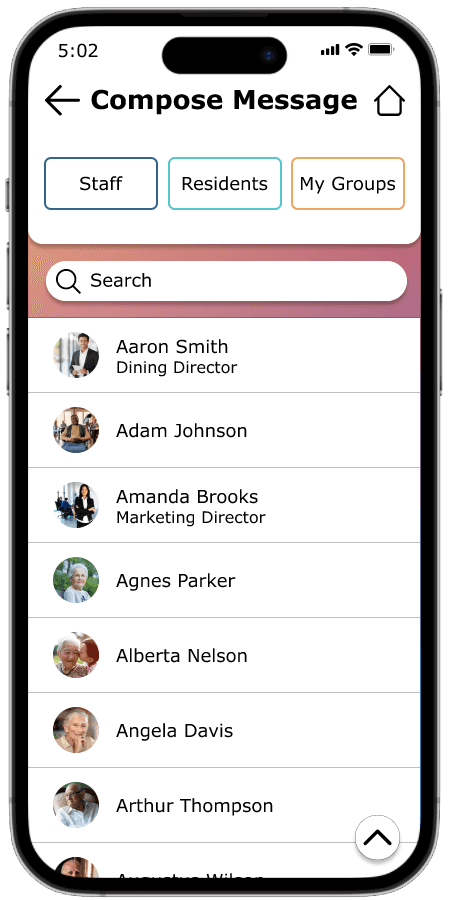
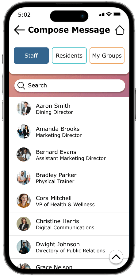
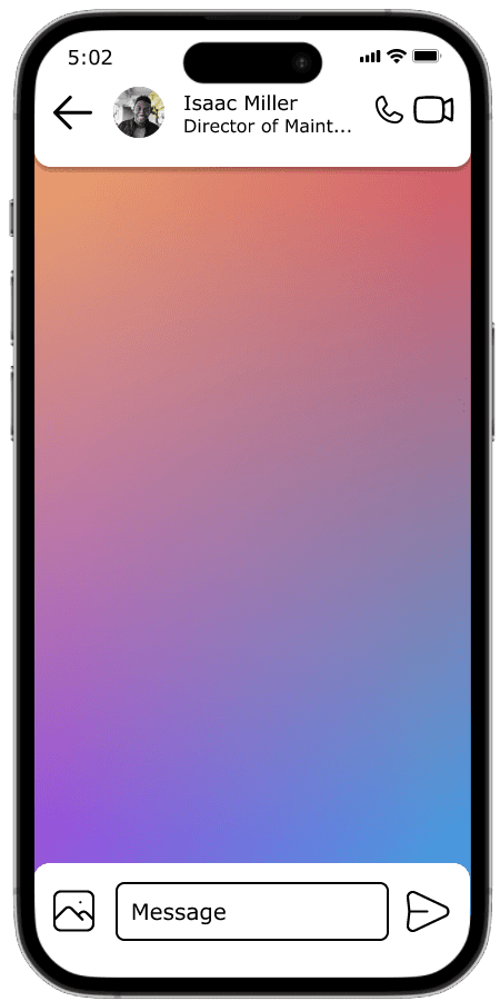
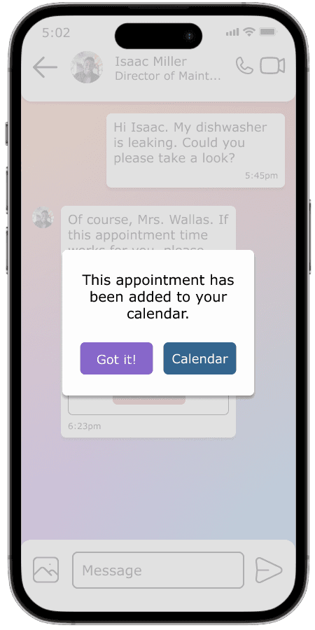
The design of the inbox is a combination of design elements pulled from Gmail and Facebook. User survey responses from residents indicated a majority used email for communication. And quite a few others were familiar with Facebook. By pulling similar elements over to this app, residents will already know how to use it.
Dining
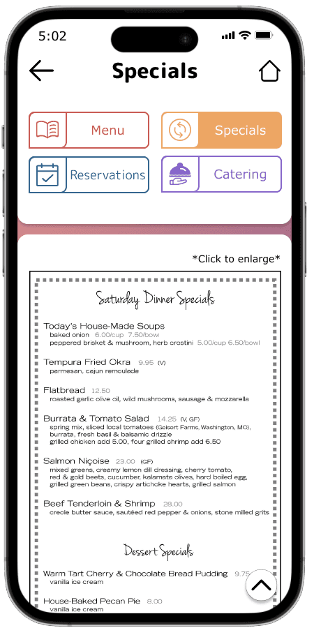
Dining is a huge component of senior living. New communities typically have multiple dining venues and all residents eating at the time is in the past. The need for users to be able to look at menus, specials, and make reservations is greater than ever.
Calendar & Events
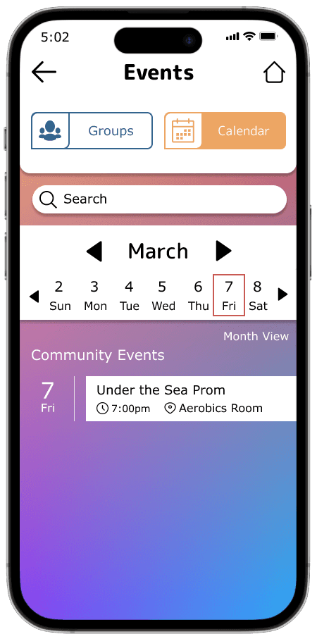
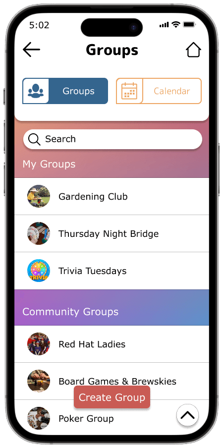
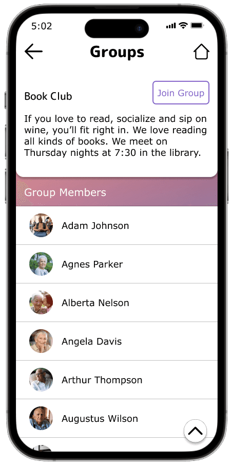
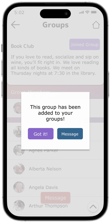
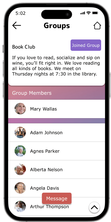
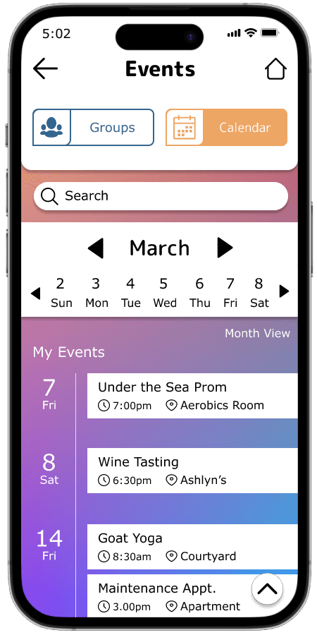
Similar to dining, activities and events are a prominent part of senior living communities. It's like college again for residents. Not only is there generally an activities director that plans weekly and sometimes daily events, but residents also create their own activities and groups. Staff members need to be able to see in real time who is joining their events. And residents need to easily be able to join groups and make groups.
Profile & Settings
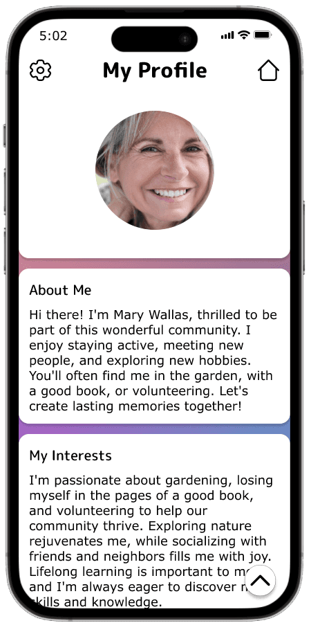
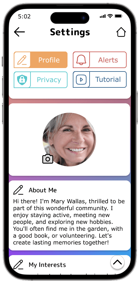
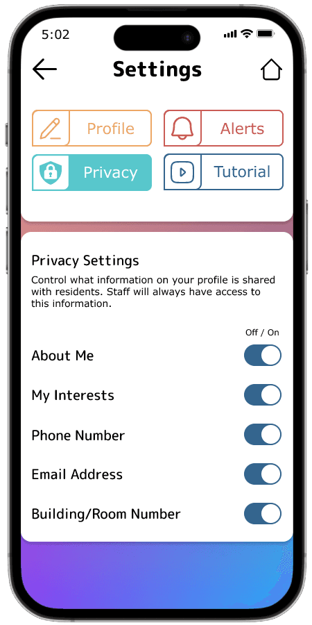
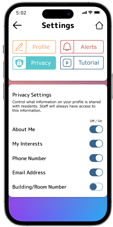
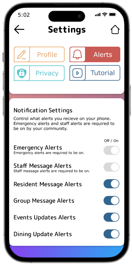
Although it's not as big of a feature as dining or events, it's still just as important. Users need to be able to feel a sense of security and privacy while using the app. They will have the control of what information populates on their profile for other residents to see. Staff would always be able to see the information. Users will also have control over what notifications and alerts they receive. Only messages directly from staff or emergencies are required.
Directory
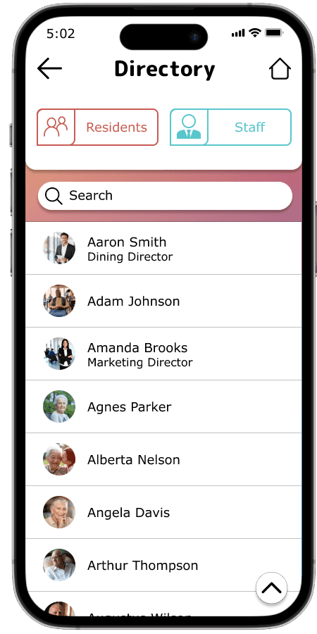
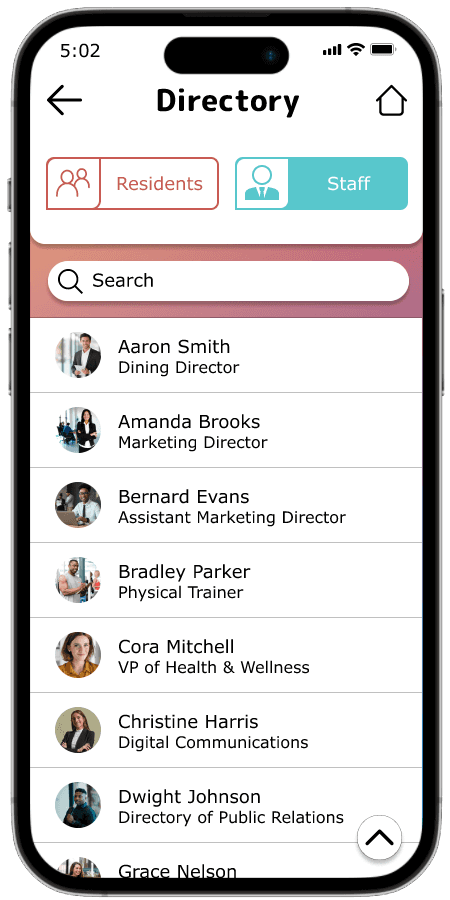
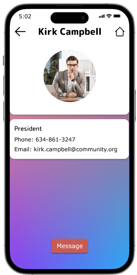
Last but not least is the directory. It's important for a resident to be able to have access to communication to any staff member as well as any resident.
Login Screens
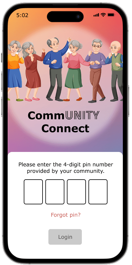
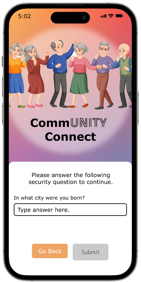
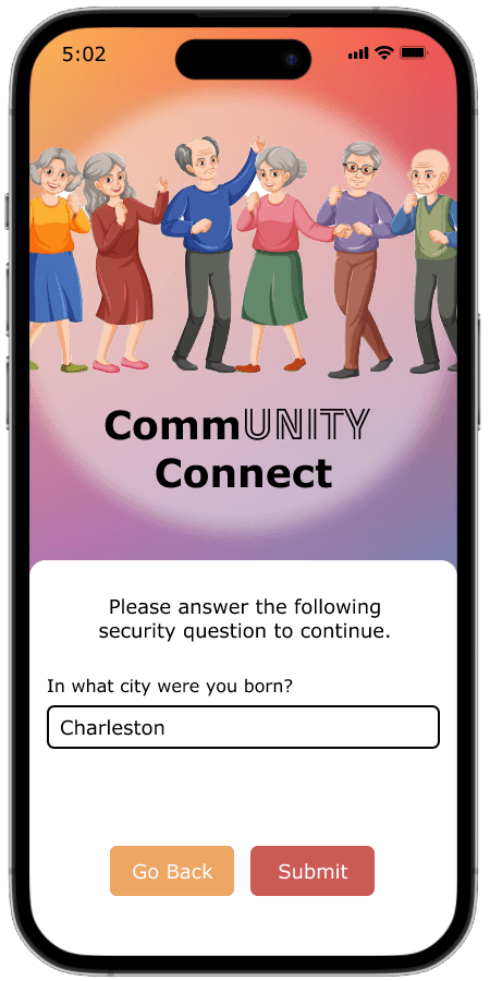
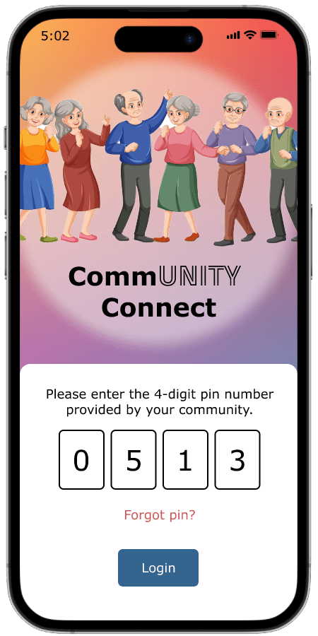
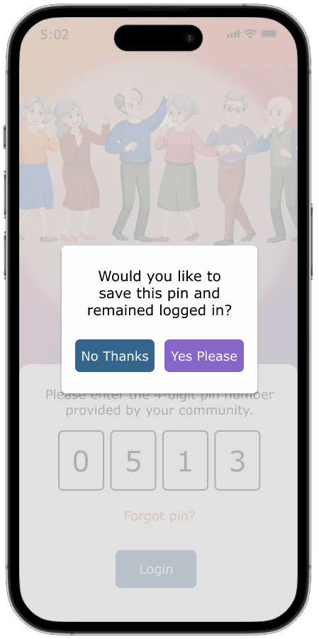
It's common for senior citizens to forget their passwords. It was requested by staff that it was important for residents to easily be able to unlock their phone directly in the app. A lot of apps require you to send an email to yourself to reset the password. Unfortunately, most wouldn't be able to remember their email password either. When up the app for the first time, residents can choose an easy to remember security question that would provide their pin instantaneously.
Reflection
My design approach focused on bridging the gap between technology-resistant older residents and those more tech-savvy individuals, ensuring an inclusive and accessible app for all users. By prioritizing simplicity, intuitive navigation and customization options, I aimed to create a user-friendly platform that fosters a sense of community and connection.
Let's take a look back at our goals and how the goals were achieved.
Goals
How might we increase engagement among older residents who are hesitant to adopt new technology?
Simplifying onboarding for residents eased their apprehensions about using a new app. Staff members expressed concerns about residents feeling left out due to unfamiliarity with new technology.
How might we design intuitive interfaces that cater to varying levels of tech-savviness among residents?
Emphasized simplicity! Fewer buttons and fewer page transitions were key. It was important to minimize complexity for this age group.
How might might we facilitate seamless communication between residents and staff members through the app?
Enabled residents and staff to chat any time and allowed easy RSVPs and group joins with a click.
How might we encourage participation in community activities and events through the app?
Fostered community engagement by allowing comments on staff posts and encouraging social group creation. These features can boost resident social interaction.
How might we streamline the process for residents to access important community resources and information?
Featured 5 main buttons on the home page for quick access to essential information. Both staff and residents have the ability to post and message for efficient information sharing.
Let's Look Ahead
Growth potential is reinforcedby user feedback and market research, projecting a strong retention rate and tech adoption among seniors.
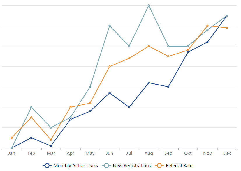
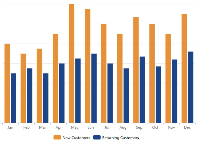
The CommUNITY Connect app holds significant potential for expansion, catering not just to residents but also staff members, addressing their need for a streamlined platform amidst the complexity of multiple software tools. Interviews with staff have highlighted the desire for a comprehensive app that integrates various functionalities. Through user data analysis and market research on key performance indicators, there's confidence that CommUNITY Connect can excel beyond existing products. Projections suggest a promising 74% retention rate in a year, with expectations of further growth as tech proficiency increases among newer generations of senior residents.
Please visit on a desktop for the best experience!
Please visit on a desktop for the best experience!
Overview
In an era where connectivity shapes our daily lives, creating community and enhancing communication within senior living environments is paramount. As our population ages, the need for intuitive and inclusive digital solutions becomes increasingly evident. I aimed to create platform designed to be a communication tool between staff members and residents, focusing on the app side for residents.
